Case study · Mobile app · Fintech

Would you give this app your bank password?

BestWallet helps people cut expenses and grow their disposable income — which means asking users to hand over the most sensitive data they have. I joined a computer science team as their product designer and made trust the design brief: every screen, word and interaction had to earn it.

Role
Product Designer
Type
University collaboration
Focus
Trust, onboarding, UI
Scope
Research → full app design

In 30 seconds

I researched how financial products earn user trust and distilled six strategies — from intentional friction to radical transparency. Competitive analysis of Mint, Acorns and Venmo showed where they fell short (long onboarding, poor contrast). I designed the full app around those findings: a security-forward linking flow, constant feedback, and an accessible blue-on-white UI.

Four BestWallet screens: entering PayPal credentials with security reassurances, the linking progress screen, the savings dashboard, and a phone-plan comparison
The core loop: link an account, see your savings potential, act on a concrete recommendation.

Research

Six ways an interface earns trust

People hesitate to share financial data — reasonably so. I researched how products can legitimately reassure users when handling sensitive information, and grounded the design in six strategies:

  • Emphasize security measures. Show the protection visually and verbally, at the moment of doubt — not buried in a FAQ.
  • Leverage friction. A little intentional slowness (verification steps) makes the product feel safer and reduces errors.
  • Give constant feedback. Real-time confirmation that every action worked and every piece of data is secure.
  • Write clear copy. Plain language, especially for users new to financial services.
  • Apply social proof. Testimonials and adoption numbers lend credibility a new product doesn't yet have.
  • Be transparent. Say why each piece of personal information is needed and how it will be used.

I also analyzed Mint, Acorns and Venmo. They used trust-building copy and security messaging too — but struggled with long onboarding flows and poor color contrast. Both became explicit design constraints for BestWallet.
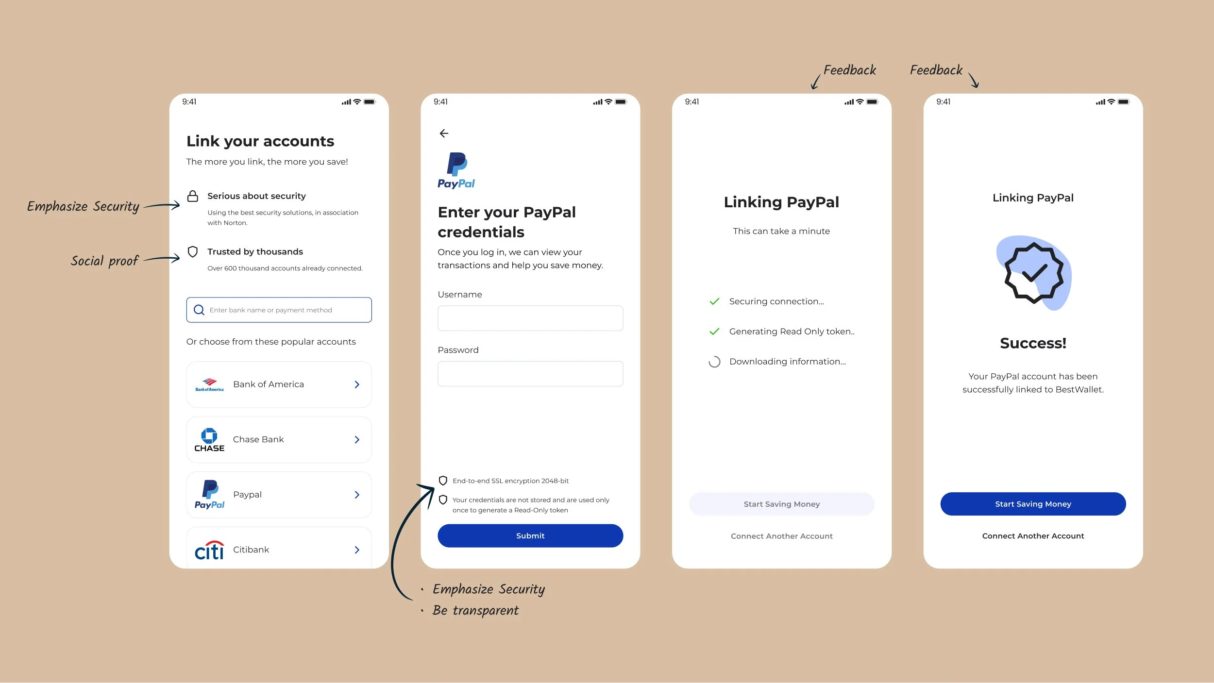
Annotated account-linking flow: the link-accounts screen highlighting security and social proof, the PayPal credentials screen with SSL encryption notes, and linking progress screens with step-by-step feedback
The linking flow with my working annotations: security emphasized at the entry point (“in association with Norton”), social proof (“over 600 thousand accounts connected”), transparency at the credentials step, and live feedback while linking.
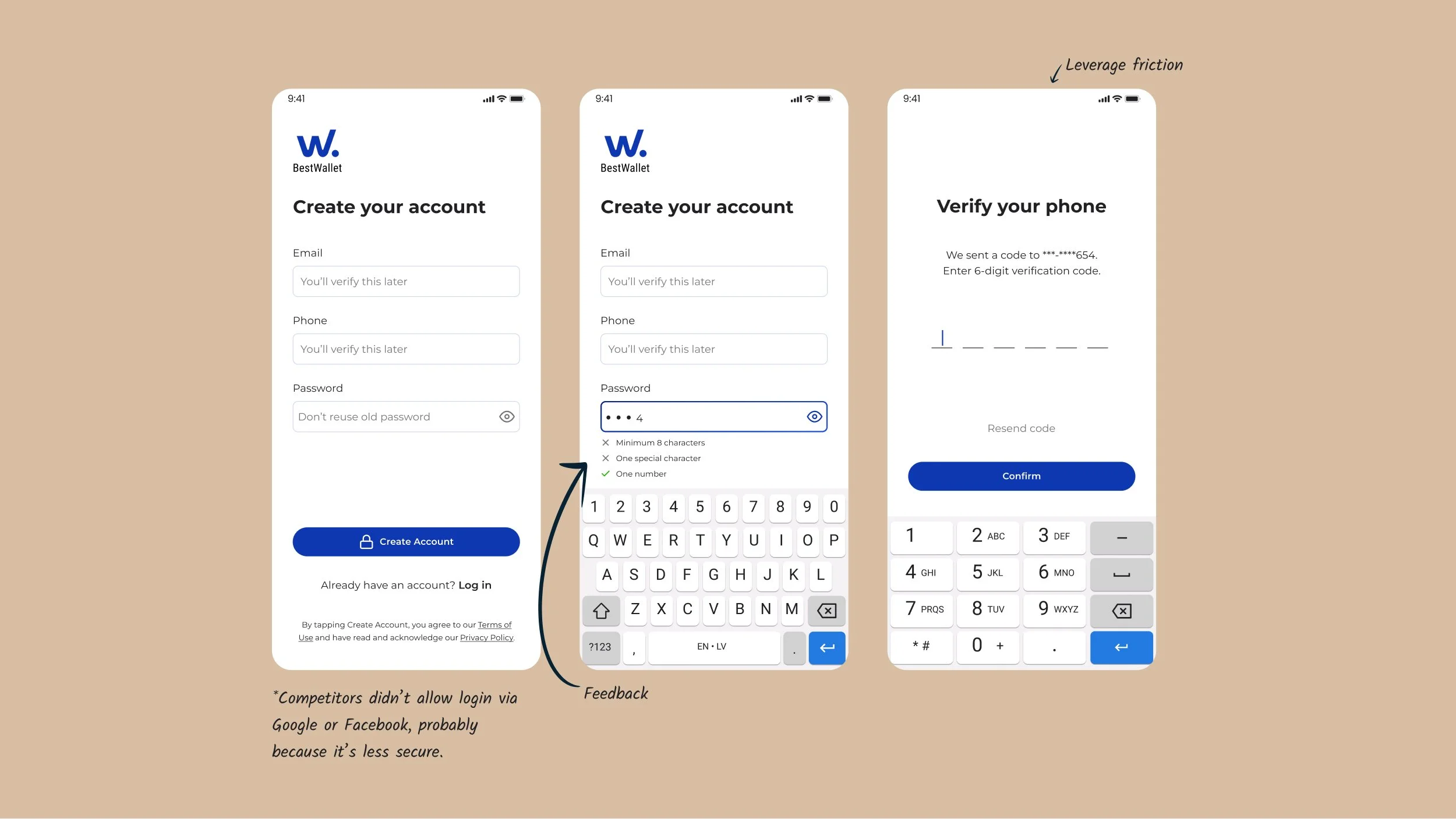
Annotated sign-up flow: account creation with inline password requirements and a phone verification step labeled 'leverage friction'
Friction, used on purpose: phone verification adds a step — and makes the product feel like it takes security seriously. Inline password feedback keeps the friction from becoming frustration.

UI design

Calm, legible, accessible

  • Color. Blue as the primary color for its association with trust and security — with contrast ratios chosen so screens stay clear and legible for users with color blindness or visual impairments.
  • Typography. Montserrat, for its legibility across letters, numbers and currency symbols — a font that supports a straightforward, honest reading experience.
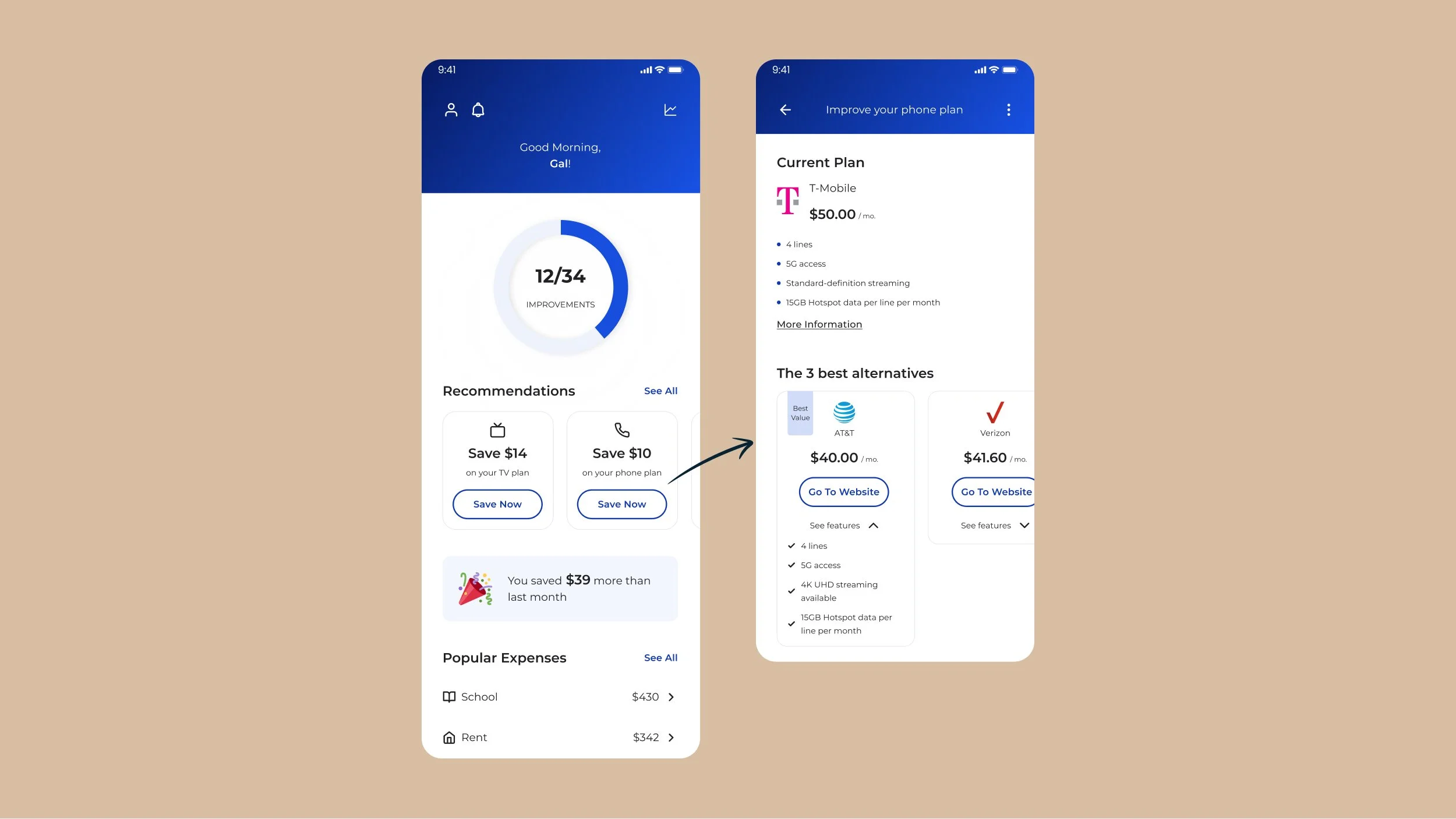
  • Layout. One primary action per screen and savings framed in concrete numbers (“Save $14 on your TV plan”), so value is always visible next to the ask.
BestWallet dashboard showing a 12-of-34 improvements progress ring, concrete saving recommendations, a 'you saved $39 more than last month' banner, and a phone-plan comparison screen with three alternatives
The dashboard makes progress tangible: a completion ring, recommendations with dollar amounts, and celebratory feedback (“You saved $39 more than last month”) that keeps users coming back.

What I took away: trust isn't a screen, it's a system — earned in small doses at every step where a user could hesitate. This project is where I learned to treat copy, friction and feedback as design materials, a mindset I carried directly into designing security products.