Case study · Mobile app

From “here are your problems” to “here's how you fix them”

Sunday Security protects organizations by securing the personal accounts of their executives — the accounts attackers actually target. I designed the mobile app from scratch, then redesigned its core experience around one insight: showing people their vulnerabilities isn't enough.

Role
Product Designer
Company
Sunday Security
Timeline
2022 – 2023
Impact
3× tasks completed

In 30 seconds

Users could see security issues in their accounts but didn't act on them. Through interviews with C-level executives, we learned they were overwhelmed and needed direction, not more data. I designed a step-by-step wizard that scans accounts and walks users through each fix. Result: a threefold increase in security tasks completed, with impact on customer acquisition and sales.

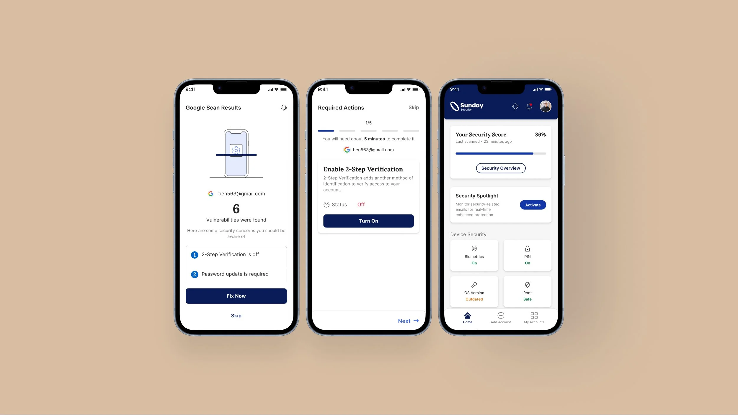
Three Sunday Security app screens: Google scan results showing 6 vulnerabilities, the required-actions wizard for enabling 2-step verification, and the home screen with a security score of 86%
The shipped experience: scan an account, get a prioritized list, fix each issue step by step, watch your security score climb.

Context

Why personal accounts matter to enterprises

Executives' personal Gmail, LinkedIn, Dropbox and social accounts sit outside the company firewall — but a breach in any of them can open a path into the organization. Managing security hygiene across all those accounts is overwhelming, so things like outdated passwords and missing two-factor authentication pile up. Sunday's app gives each user visibility into all of their accounts in one place.

I joined the team in its early stages as its product designer and designed the app from scratch: user flows, information architecture, a customer journey map, the UI, and a comprehensive design system — working closely with development, marketing and product.
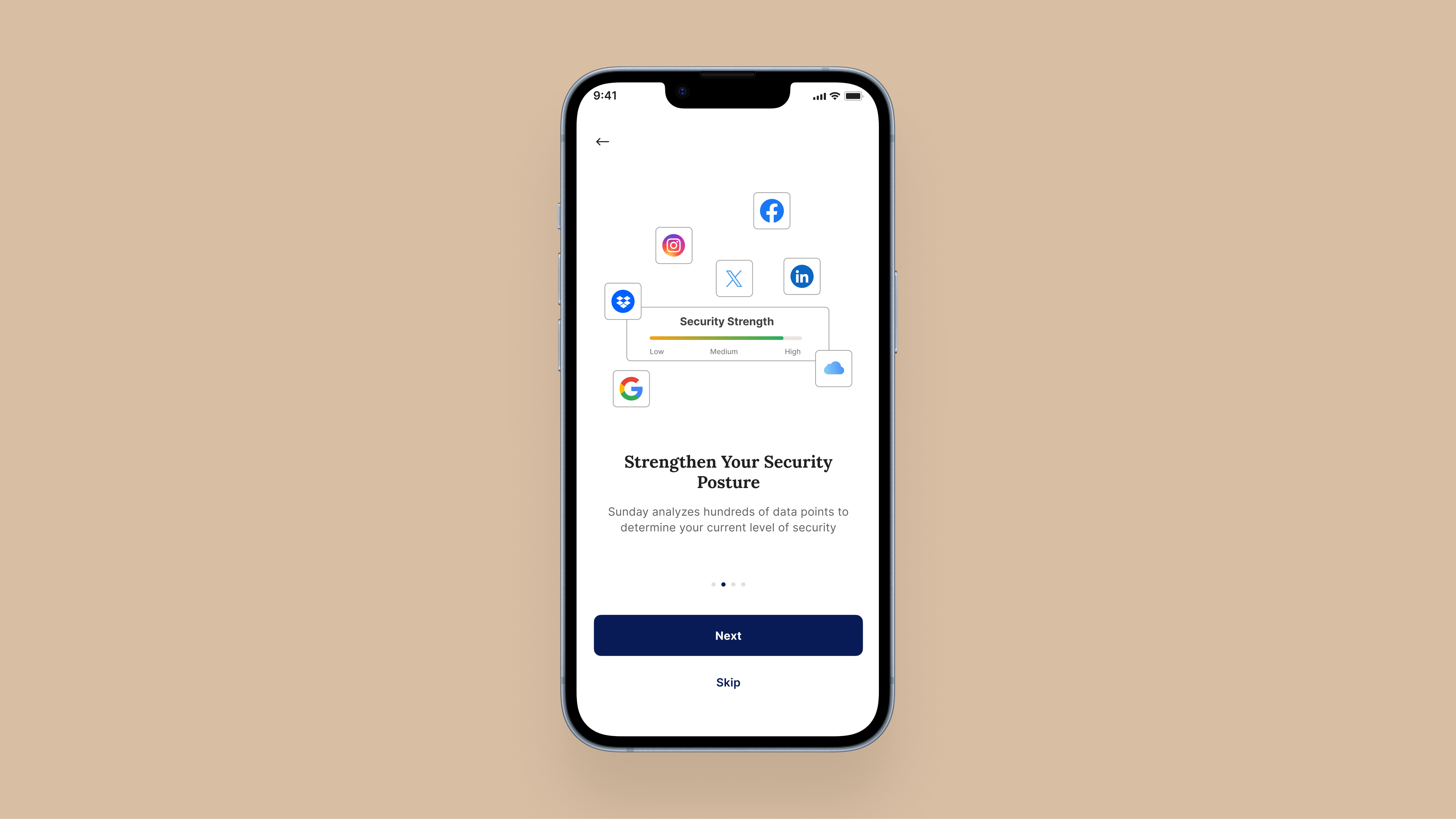
An onboarding screen, 'Strengthen your security posture', showing personal account logos linked to a security-strength meter while Sunday analyses the user's current level of security
It starts with the accounts themselves: users connect their personal Gmail, LinkedIn, Dropbox and social profiles, and the app begins reading the real security posture behind each one.

Problem

Visibility without direction

The first version of the app displayed each account's security settings — breached passwords, missing 2FA, risky permissions. Our assumption was that showing people their problems would be enough to make them act.

It wasn't. Users understood that something was wrong, but not what to do about it. The information was accurate and complete — and it just sat there.

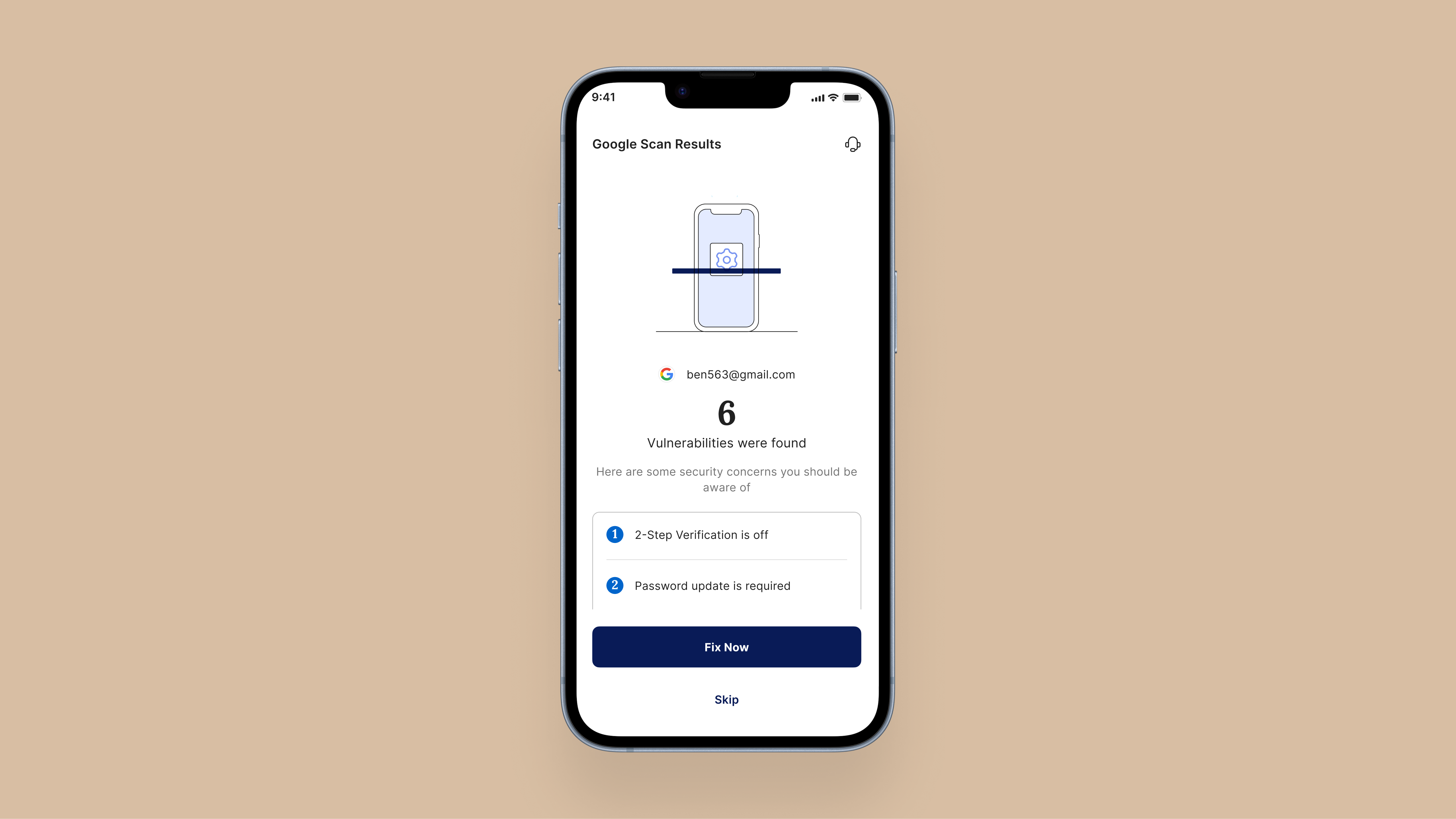
The Google scan results screen: 6 vulnerabilities found, with a list of security concerns the user should be aware of
The scan did its job — “6 vulnerabilities found” — but a diagnosis without a next step is just a longer to-do list.

Research

Listening to the people we were protecting

We interviewed potential users — primarily C-level executives — about how they perceive and handle their personal security, and researched how high-profile individuals manage their online accounts. Three needs kept coming up:

  • Centralization. One place to manage every account, not ten different settings pages.
  • Guidance. Clear, actionable instructions — not just a list of what's broken.
  • Proactive support. Alerts and recommendations that get ahead of emerging threats.

Users weren't ignoring their security issues. They were overwhelmed by them.

Design process

Designing the guided path

I reframed the core experience around action instead of information. The home screen now leads with a security score — a single, glanceable measure of how protected you are, and a number people actually want to move. From there, a step-by-step wizard turns complex security work into small, finishable tasks. Each step does three things: explains what the issue is, why it matters, and exactly how to fix it — so users are never left guessing what to do next.

The wizard walks through issues in priority order, so the fixes that matter most come first, and each step carries a light time estimate (“about 5 minutes”) to lower the barrier to starting. The aim throughout was to make security feel less like a report card and more like a path someone could actually follow to the end.

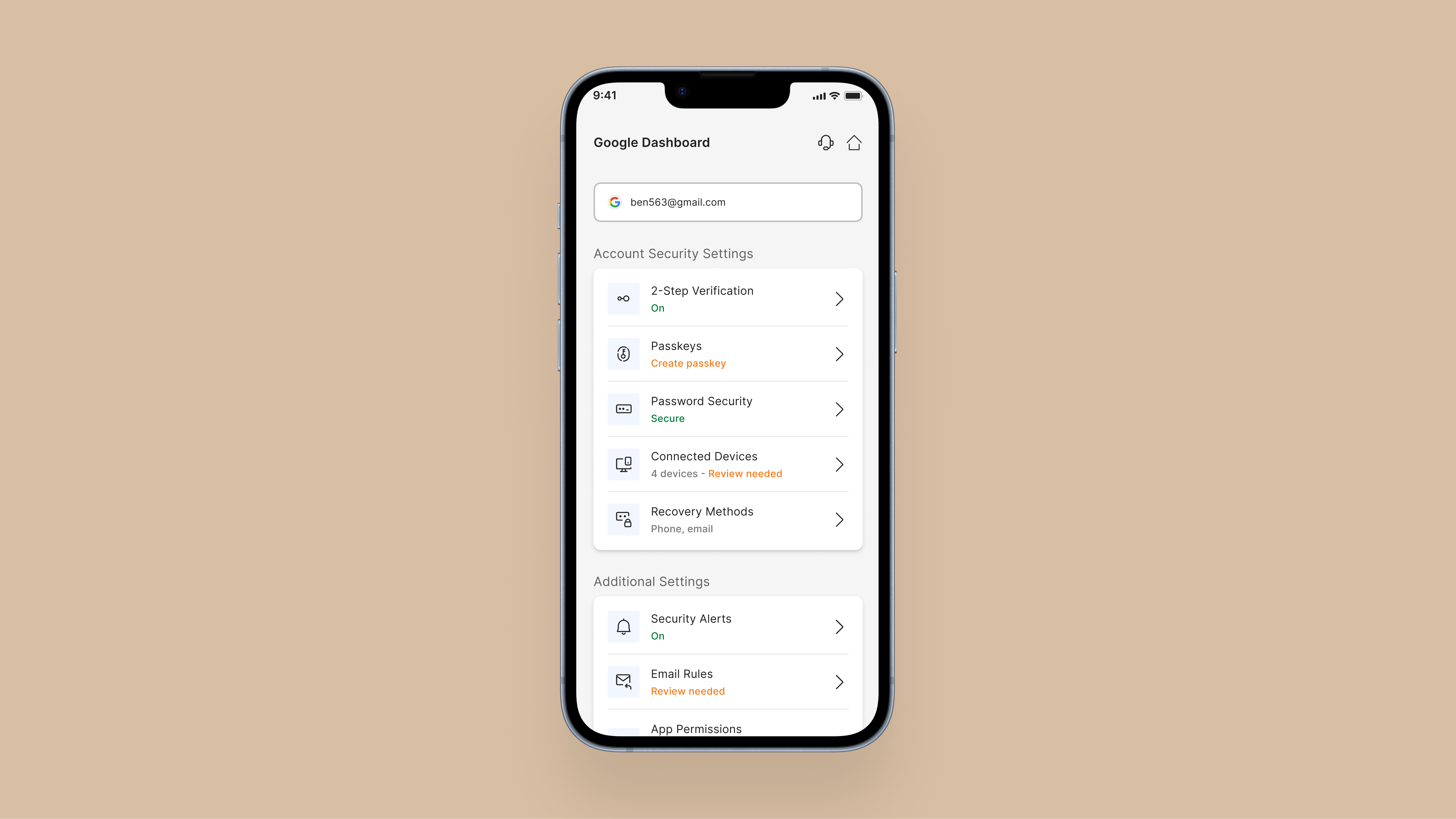
A Google account inside the Sunday Security app, showing every security setting in one place: 2-step verification, passkeys, password security, connected devices, recovery methods, security alerts, email rules and app permissions
Centralization in practice: each account gathers all of its security settings into one view, so nothing hides across ten different settings pages.
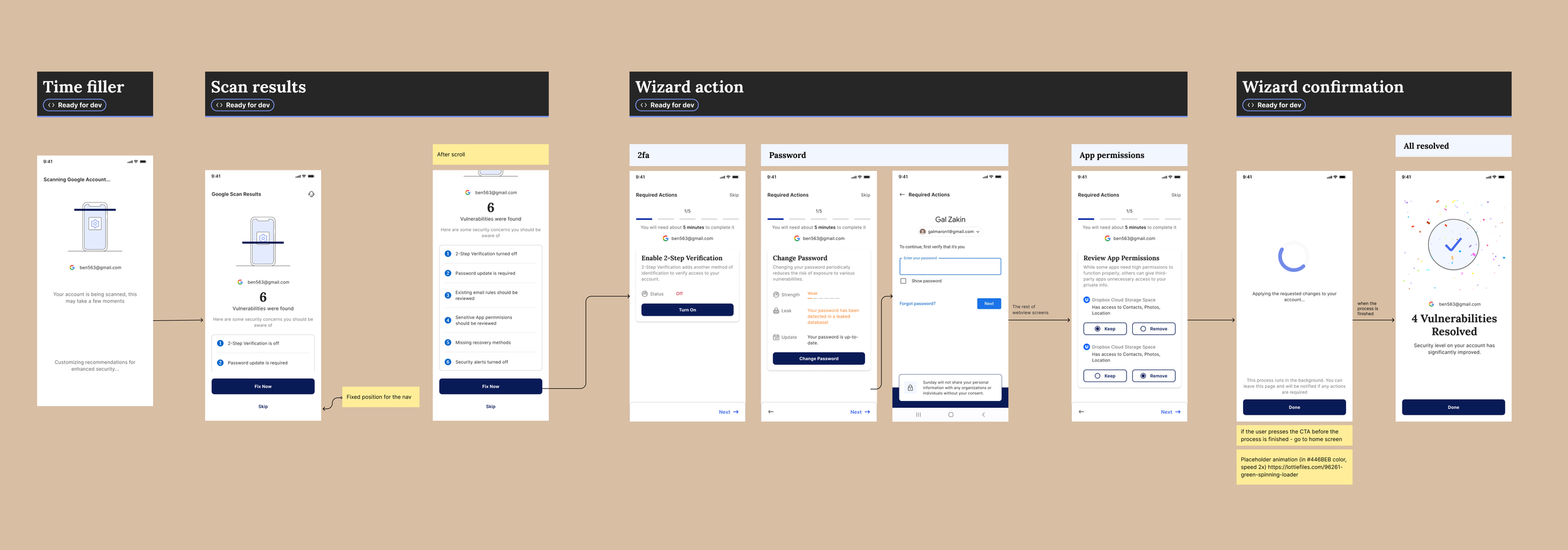
The complete wizard flow in Figma: time filler, scan results, wizard actions for 2FA, password and app permissions, and confirmation — annotated and marked ready for development
The wizard flow in Figma.
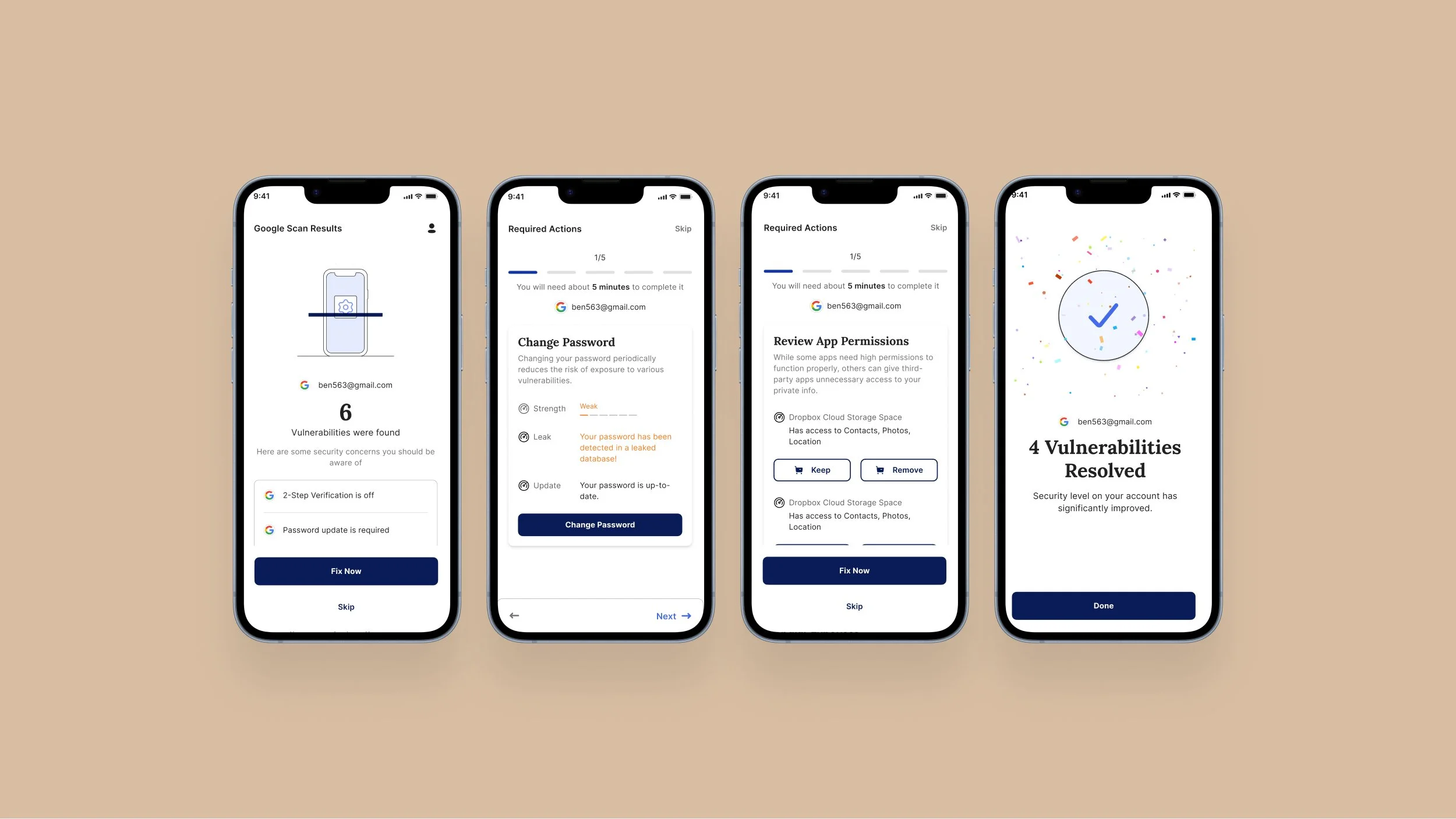
Four app screens showing the wizard journey: scan results with 6 vulnerabilities, a change-password step explaining the leak, an app-permissions review step, and a celebratory '4 vulnerabilities resolved' confirmation
Each wizard step teaches while it fixes: the password step shows why ("detected in a leaked database"), the permissions step shows what each app can access. Finishing earns a moment of celebration.
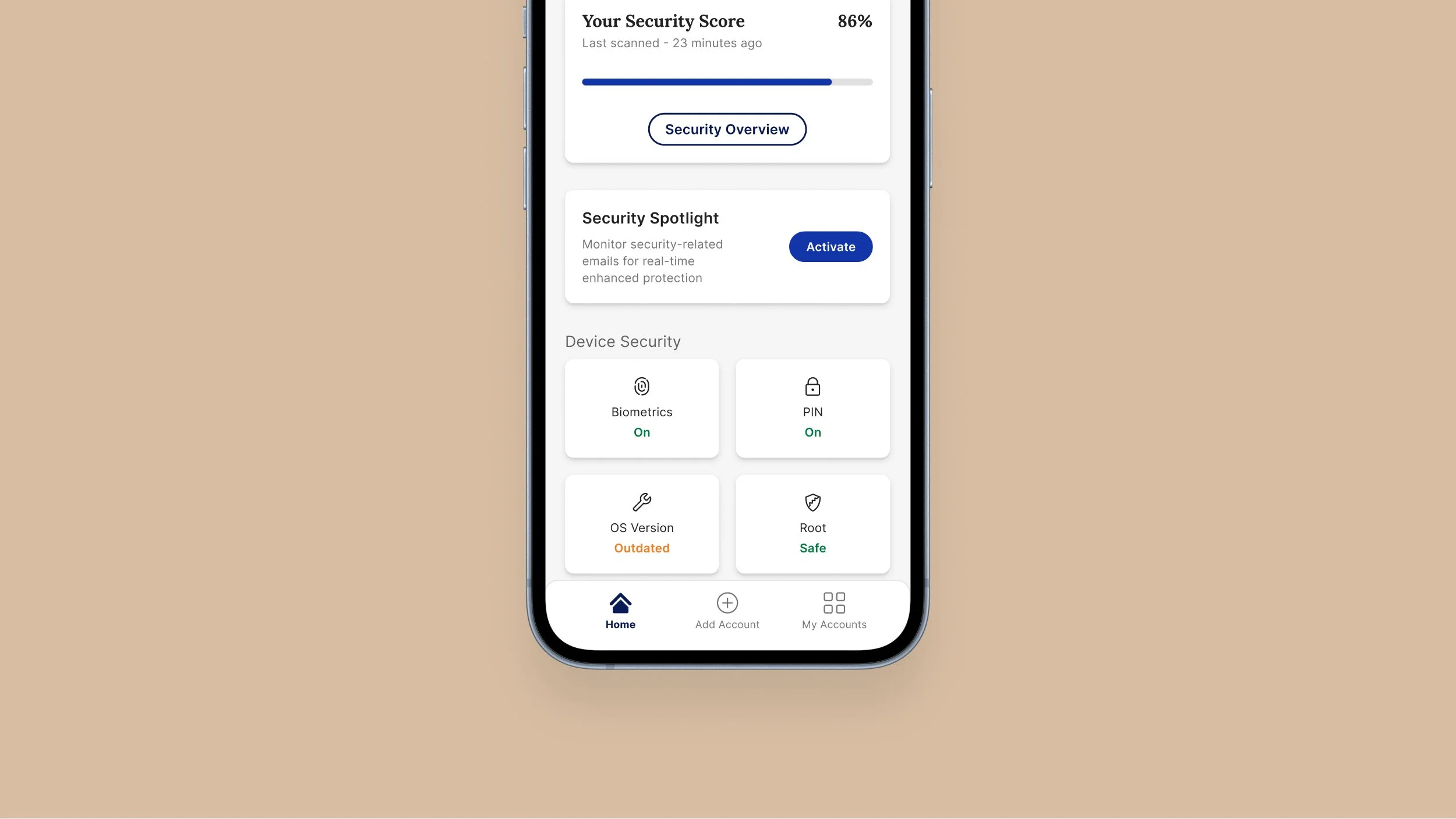
The Sunday Security home screen with security score, security spotlight activation card, and device security tiles for biometrics, PIN, OS version and root status
The home screen: one score to care about, one obvious next action. Device security joins account security in the same mental model.

Results

What changed

increase in security tasks completed by users compared to previous periods
improved customer acquisition and sales, driven by a product non-experts could finally use
+ security management became accessible to a much broader audience than security professionals

What I took away: identifying issues is the easy half of the job. The wizard worked because it closed the gap between knowing and doing — and that principle now shapes how I approach every complex product: don't just inform, guide.

Future work

A more proactive home screen

One idea still on the table: a redesigned home screen that surfaces connected accounts and real-time security alerts together, so issues get caught and acted on the moment they appear. This is a concept, not a shipped feature — the direction I'd want to explore next.

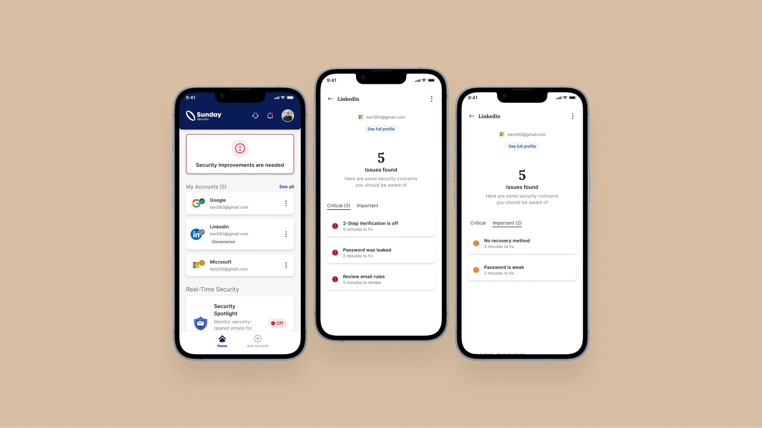
Concept for a redesigned Sunday Security home screen showing connected accounts and real-time security alerts, alongside per-account issue lists for LinkedIn
A concept, not a shipped screen: a home view built around connected accounts and real-time alerts.